Types of Stock Charts: Line, Bar, Candlestick and More Explained
Types of stock charts are used to display price movements in different ways. Therefore, when you understand the differences between line, bar and candlestick charts, you can choose the chart that best suits your own trading style.
Line Chart — Simple & Easy
Line chart is the most basic type of stock chart. It connects the closing price of each period with a single line. Additionally, it helps investors see long-term trends without too much visual clutter.
Disadvantage: Does not show open, high or low prices.
Advantage: Easy to read, clearly shows the direction of the trend.
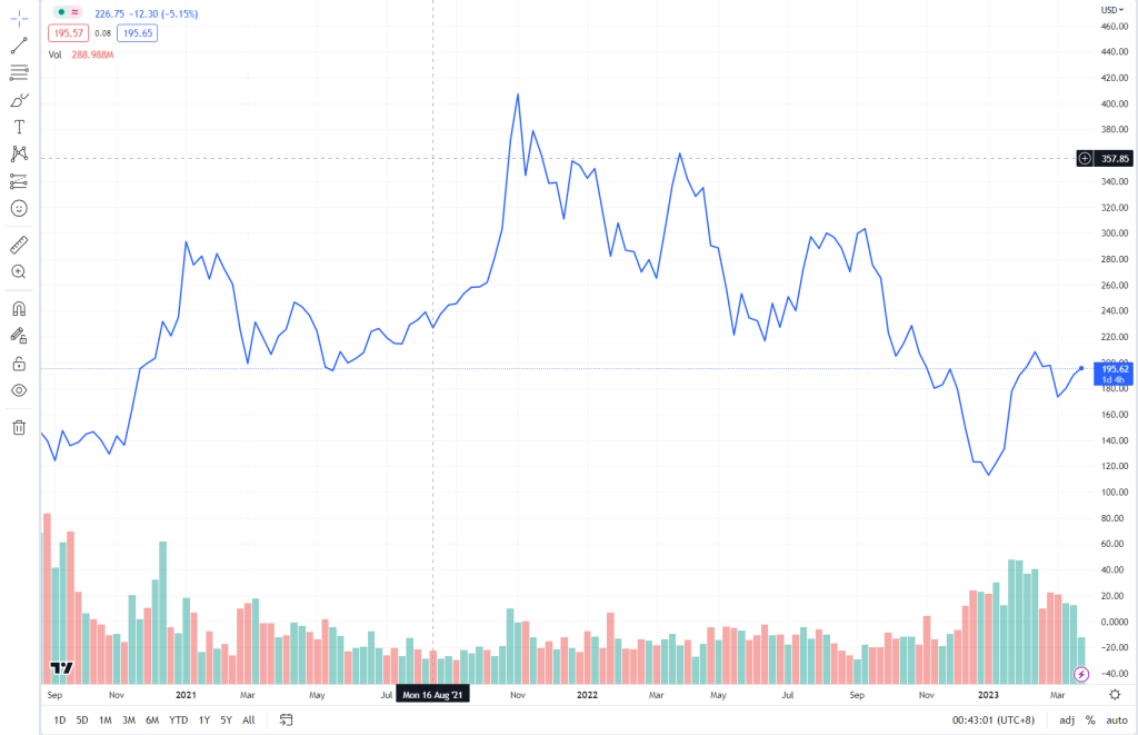
This chart uses only a single line to show price movement. Each price point is connected together. It can be used to identify trends easily.
The tick chart on the Mplus platform is a line chart for one minute. For identifying trends, using a line chart is much simpler.
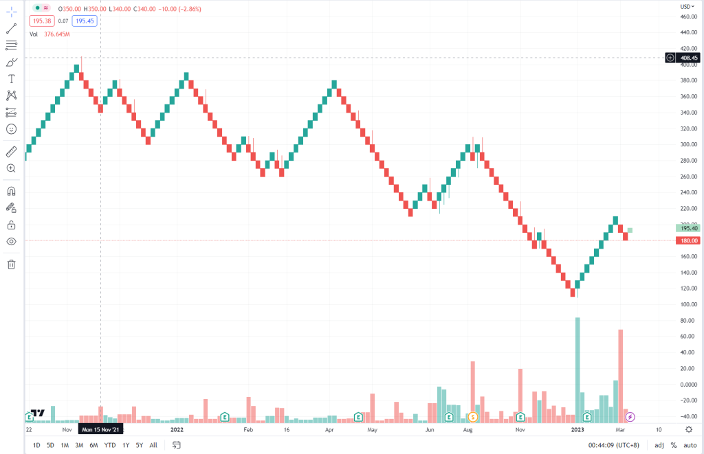
Bar Chart — Comprehensive Yet Compact
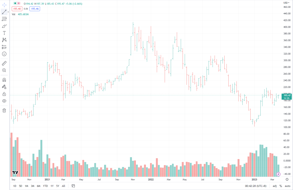
Bar chart provides open, high, low and close (OHLC) price information. Its form is simple, yet packed with information. Furthermore, this chart is suitable for investors who want more detail without overly complicated graphics.
Disadvantage: Takes time to get accustomed to reading this chart.
Advantage: More complete information than a line chart.
It uses the same concept as a candlestick chart, except that candlestick charts are more visually appealing and easier to interpret.
Red indicates that the counter or company closed lower than the open price.
Some Elliott Wave practitioners prefer using bar charts over candlestick charts.
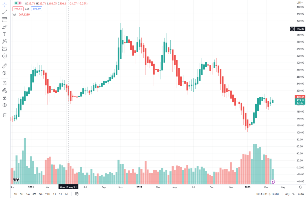
Candlestick Chart — Popular & Visual
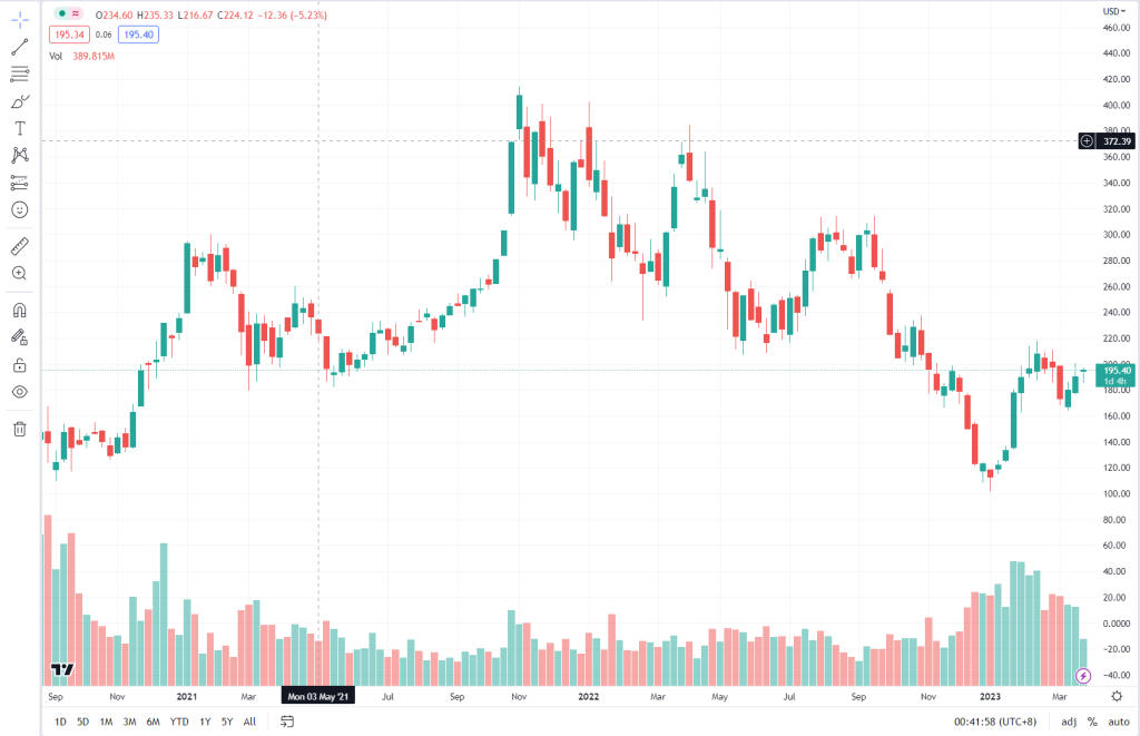
Candlestick chart is the most popular type of stock chart. Each candle shows the open, close, high and low prices. In this way, it is easier to understand compared to a bar chart.
Disadvantage: Sometimes too many candles make the chart look crowded.
Advantage: Clear visuals, easy to recognise patterns such as doji or engulfing.
Believed to have originated in Japan, it was used by Munehisa Homma and later brought to the West.
By observing candlesticks, the shape and formation of several candles produce buy or sell signals. It can easily depict market psychology and is considered a ''leading indicator'' compared to other technical indicators.
Heikin Ashi Chart
Unlike a candlestick chart, Heikin Ashi uses a unique calculation to smooth out price movements and produce a clearer picture of the current trend.
Renko Chart
A chart that does not take time into account; instead, it is based solely on price movement. Each block represents a price increase or decrease according to a specific increment.
Kagi Chart
Like Renko, Kagi also does not take time into account. Lines are only drawn when the price surpasses a certain level or increment. It is useful for identifying long-term trends or areas where a reversal or trend change is likely to occur.
Point And Figure Chart
Almost similar to Kagi, except it uses X and O symbols as price indicators that do not involve time.
Conclusion
There are various types of charts used by technical analysis practitioners, and the most commonly used is the candlestick chart.
We hope this article is beneficial for all of you. For the full list of articles related to technical analysis, head over to Complete List of Technical Analysis Articles.
Level Up Your Investment Knowledge
Successful investing starts with solid knowledge.
Investment Basics:
Download our free ebook for a complete guide.
Open a CDS Account:
Ready to begin? Open a CDS account now.
FAQ About Types of Stock Charts
What type of chart is most suitable for beginners?
Candlestick chart is the most suitable for beginners because it displays complete information including open, close, high and low prices in an easy-to-understand visual format. Most professional traders worldwide also use candlestick charts as their primary choice.
What is the difference between a line chart and a candlestick chart?
A line chart only shows a single price point (usually the closing price) and connects them with a line. A candlestick chart, on the other hand, shows four pieces of price information — open, high, low and close — for each time period, providing a more detailed picture of price movement.
When is it appropriate to use Renko or Kagi charts?
Renko and Kagi charts are suitable when you want to filter out market noise and focus solely on significant price movements. Both do not take time into account and only draw movements when the price surpasses a certain level, making them useful for identifying long-term trends.
Do I need to master all types of charts for trading?
You do not need to master all types of charts. Focus on candlestick charts first as they are the most widely used and have many patterns that can aid trading decisions. Once you are proficient, you can explore other charts such as Renko or Point and Figure for additional perspectives.
Understanding the various types of charts is the first step in technical analysis — choose the chart that suits your trading style to make more accurate investment decisions.
Open a CDS account today to start applying chart analysis in your stock trading on Bursa Malaysia.
Download the free Stock Basics Ebook to build a strong foundation in stock investing from scratch.
Further reading: